Guide 045 min read
LlamaPresenter - Custom Slide Templates
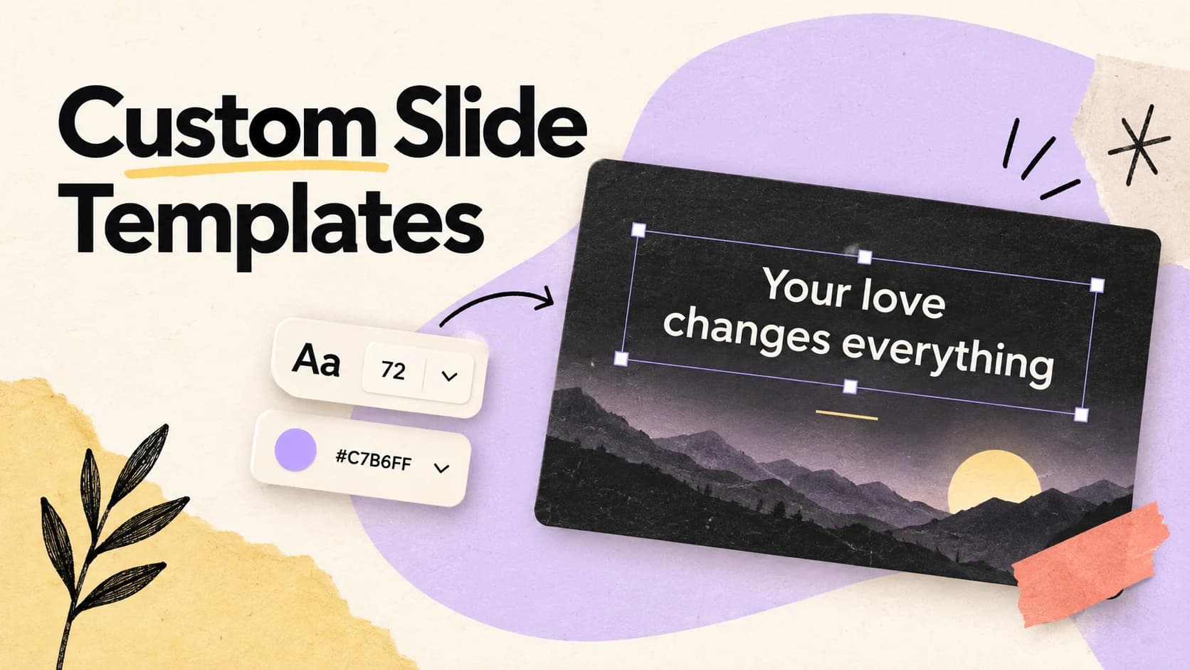
A beautiful sample slide proves almost nothing. Sunday content is unpredictable: one verse is six words, the next is six lines, and a translated chorus may be twice as long as the original.
The useful question is not “Can I make this slide look good?” It is “Can I make a system that keeps looking good when the words change?” That is the job of a template.
What this guide helps you do
Make reusable slide designs that keep verses and lyrics clear on every screen.
01
Begin with the safe areas
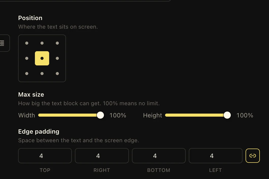
Start by placing the main text box where every background remains readable. Leave more breathing room than the demo verse seems to need. A template should protect the longest real content, not flatter the shortest sample.
Add supporting elements only after the reading area is settled: a reference, a translation label, a logo, or a quiet plate behind the words. Each element has a job, so each should earn its space.
- 01Place the primary text area and test it with unusually long content.
- 02Choose alignment, font, case, line spacing, and text treatment.
- 03Add references and labels, then check that they never compete with the words.
02
Treat readability as part of the design
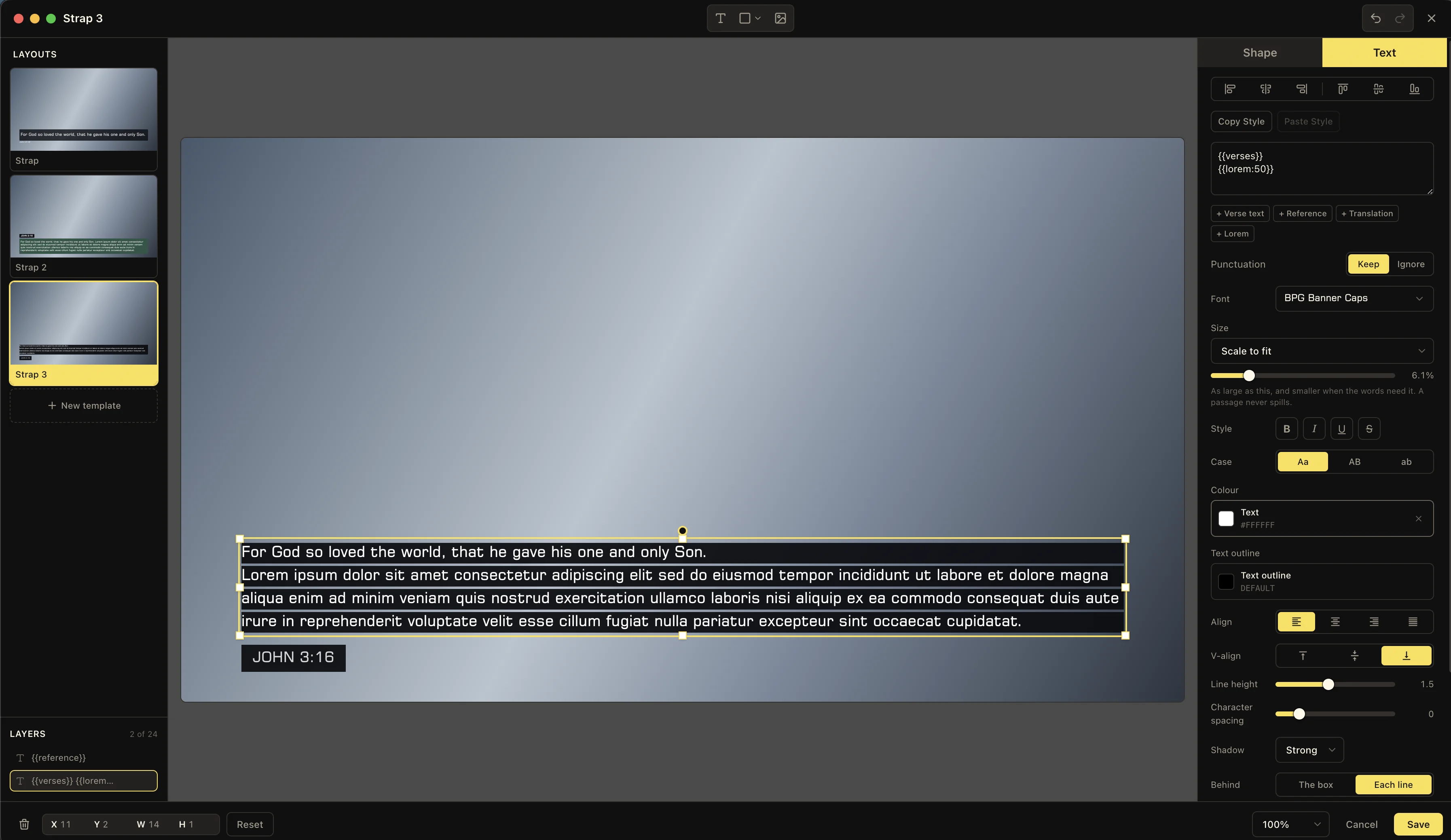
Photos and motion backgrounds change from bright to dark without warning. A text outline, shadow, or plate can preserve contrast without forcing every service to use a black rectangle. Plates can sit behind the whole box or follow individual lines, depending on the look you want.
Test the template from the back of the room, not only from the laptop. The right type size on a close monitor can still be too small on a distant projector.
The ten-second test
Try a very short line, a very long line, a bright background, and a dark background. If all four remain calm and readable, the template is doing its job.
03
Let every output have its own composition
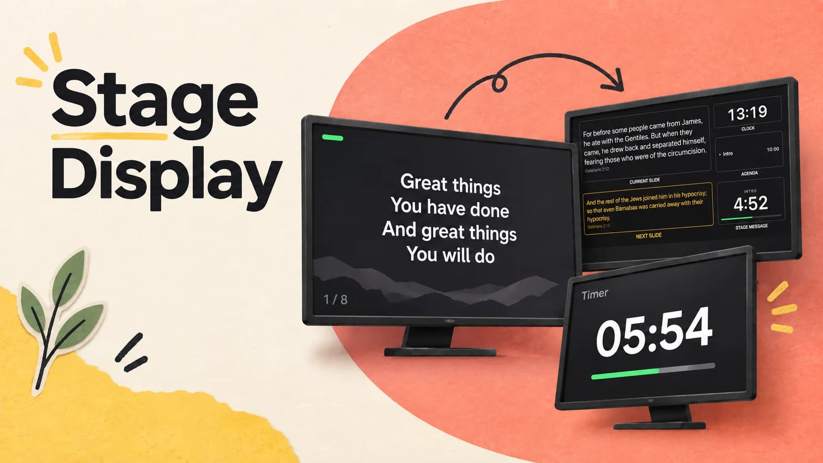
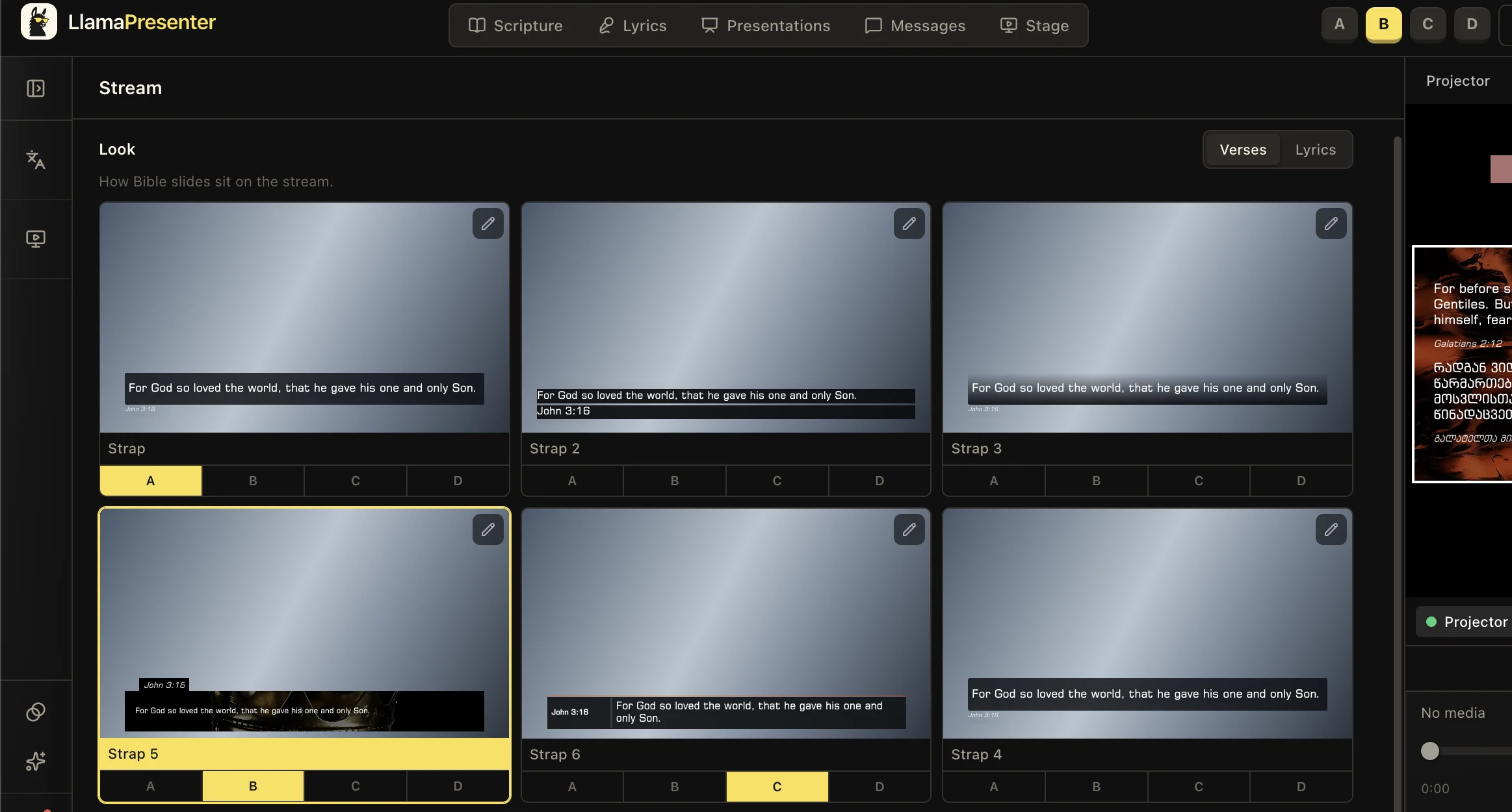
A projector slide, livestream graphic, and stage display are three different canvases. The projector can be cinematic. The stream usually needs compact text that avoids faces and captions. The stage needs information before decoration.
Create a look for each job instead of shrinking one layout until it fits everywhere. The live content stays synchronized while each audience receives a composition made for its screen.
Keep these three
The short version
- Design around difficult real content, not the perfect sample slide.
- Use outlines, shadows, and plates to keep changing backgrounds readable.
- Give the projector, stream, and stage layouts built for their jobs.